The Project
Situation:
WYOS, a start up in the personal care space targeted toward Gen Z, was rapidly gaining traction and was expanding into more retail stores like Urban Outfitters. Without a solid brand strategy and brand book firmly in place, the brand risked being brought to life in an inconsistent and irrelevant way.
Objective:
Develop a brand strategy that brings to life the unique benefits of WYOS in a way that is relevant to Gen Z and refresh the existing brand book and visual identity to reflect the new strategy.
What We Did:
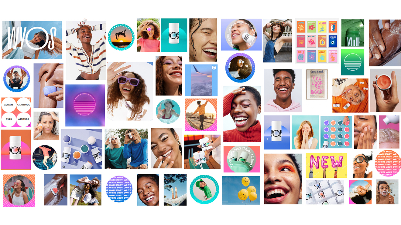
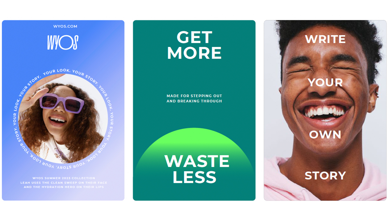
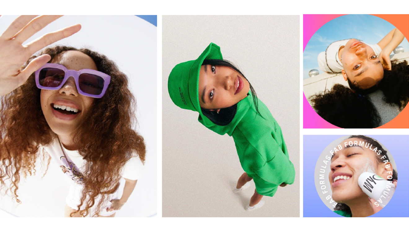
In collaboration with the WYOS founders, we developed the WYOS brand house that was informed at the intersection of culture, the products unique benefits and the lifestyles of Gen Z’s. From the brand strategy, we revised their brand book including color palette, imagery direction, typography and iconography.

More Projects
